Hey all,
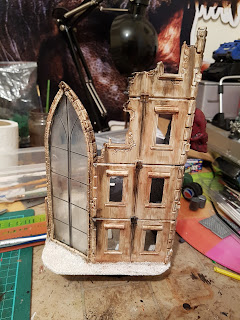
I'm here again with another scenery splurge, this time not a scratch built building, but a repurpose of some older kits I bought, with a few additions.
The biggest addition to this pieces is the window which I salvaged from an old Ozzy Osbourne figure I have and seem to have misplaced
After a general undercoating of white I decided to make this as grimey as possible. My thought being a light colour building in a highly in industrial/polluted area would cause mass amounts of pollution streaks and decay.
The interior was done grey to oppose the white exterior and the floor was glazed with Guilliman blue, to stand out a little from the walls.
A very rough Apothacary insignia on the window to show what it is, but to also show how run down and desperate the areas is, it's rough, doesn't quite match the proper logo and a little streaky, like it was done on a budget, or by defective servitors..... or at least that's the story in going with ;)
Another large addition is the red skull. My idea behind this is like on some shops and pub/bars that have a hanging sign to make them more visible at a distance. Looking for the Doctor? Search for the red skull!
I even added a little desk to give it some feeling of 'life', which I'm hoping to get a bit of across my board.
Well that's it for now, and as always feel free to leave a comment below whether they be good, bad or inbetween!
Zebulon


No comments:
Post a Comment